


How we increased CTR through improving UX/UI design

Glo
Glo is a technology enabled health and wellness company focused on providing an online yoga and meditation platform that features thousands of professionally-filmed yoga, meditation, pilates and educational materials.
Client’s Challenge
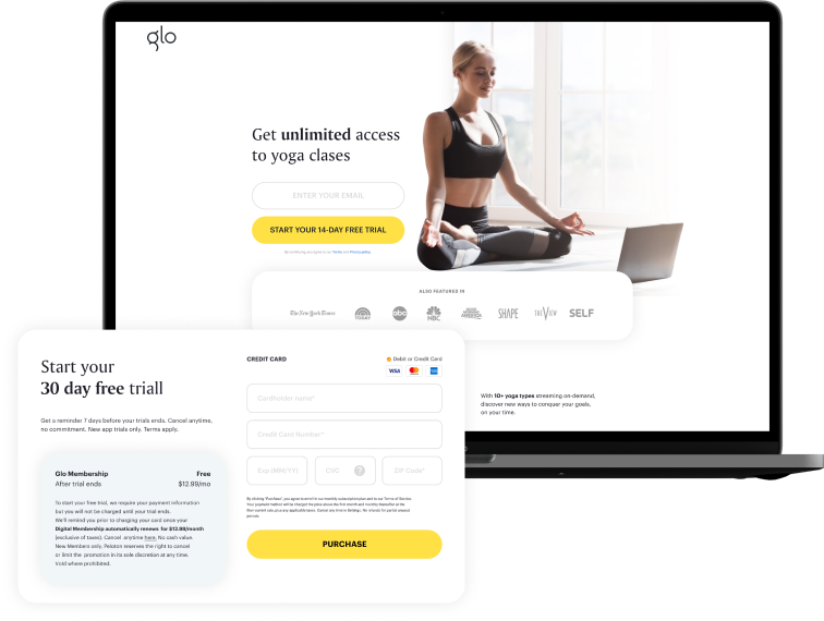
Website didn't have a quality design and good user experience.
It took only a few seconds for a lot of new users to leave a site.
Web homepage didn’t include all the information that a visitor needed.
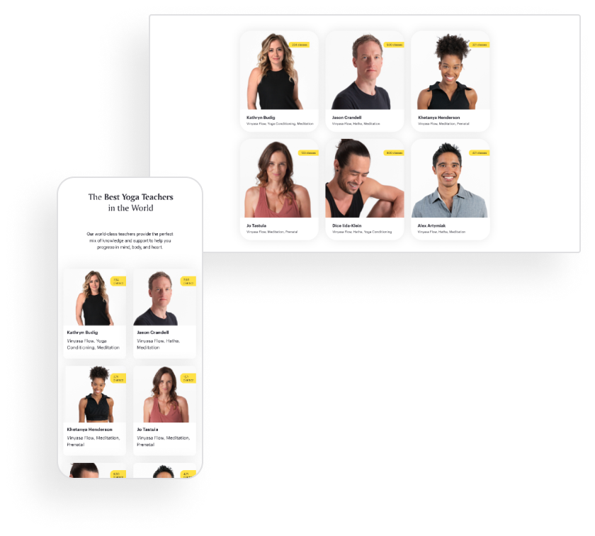
Only a handful of coaches had a permanent teaching workload.
Goal
Improve CTR.
Increase user engagement.
Increase coaches’ workload.
What’s been done
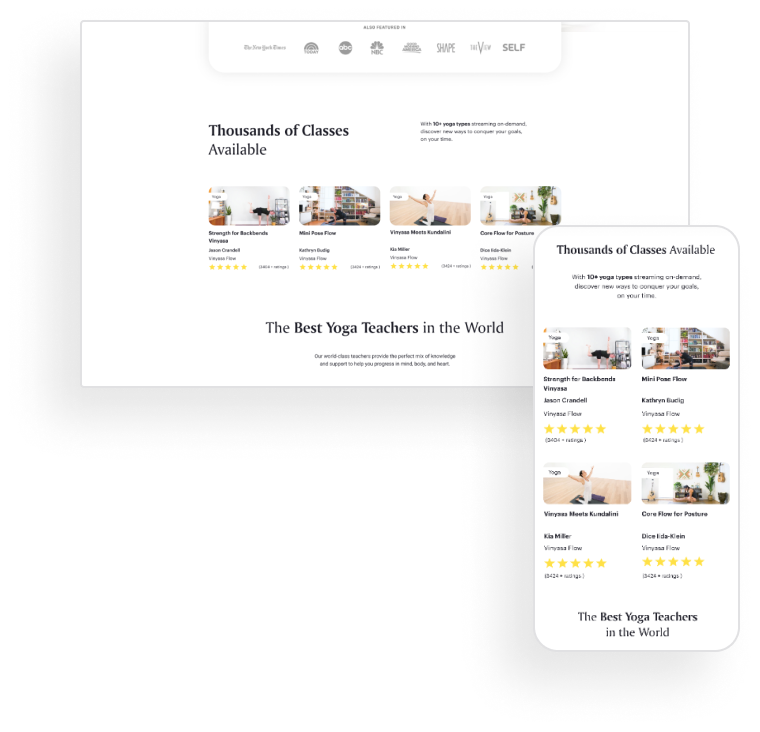
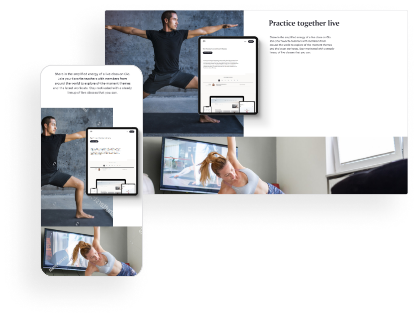
Transformed UX/UI, improving design, changing color combinations, fonts, white spaces, creating understandable and convenient user flow for subscribers. Customers can find class suggestions, easily access their go-to practices, view curated class collections, and stay up to date on their latest classes and community favorites.
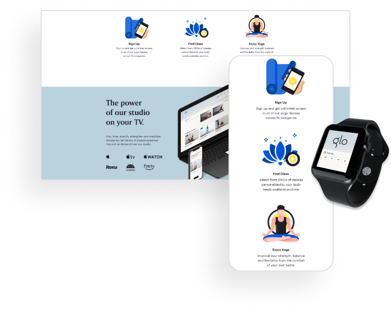
Launched video streaming. Subscribers choose classes online and start practicing yoga in real time with Glo’s yoga class streaming offering.
Created coaches’ personal accounts. Now they can track their schedule, see notifications and recommendations, receive feedback and fill out their monthly reports.
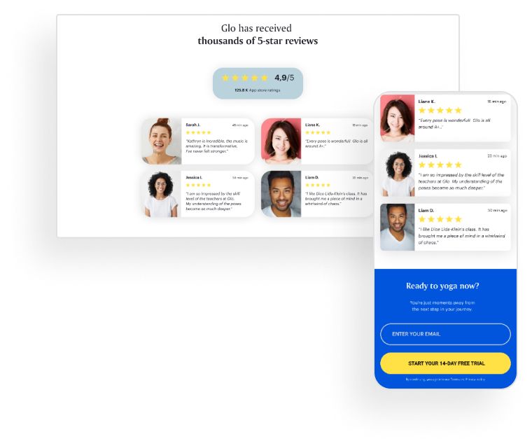
Improved users’ support system. Subscribers receive individual programs and recommendations for personal growth, read useful blogs and leave feedback.
Result
Significantly Improved CTR.
Increased coaches' workload.
Increased customer engagement.
Available on IOS, Android.


